Using CSS Grid and Box Alignment Properties to build form layouts
Enkya
October 19, 2018
10 min read
 Photo by Michal Sycz on Behance
You probably used Flexbox and were impressed. Get ready to explore the next step in building high quality layouts for the web.
CSS Grid is a two-dimensional layout system designed to tackle challenges around displaying many data points on variable size displays.
Why CSS Grid?
- Responsiveness
CSS Grid makes it really easy to build layouts that adapt to different screen sizes. Part of this is achieved by the introduction of relative units like fraction (fr) and other properties like minmax().
Combining Grid properties with other CSS properties like Media Queries gives more power to declare structure for different screen sizes. - Declarative Syntax
The CSS Grid specification provides properties that create layouts declaratively; there is an ability to determine layout from a higher level without specifying the exact procedure by which one arrives at that structure.
This provides clear advantage over older layout specifications like Flexbox. - Reduced verbosity
Because of the declarative nature of CSS Grid, one does not need a lot of code to arrive at similar layouts when compared to layout models like Flexbox.
Note: Grid is a modern layout. It is important to look out for browser compatibility issues. Visit caniuse to view browser support
The CSS Align module attempts to create a cohesive and common box alignment model to share among all of CSS.
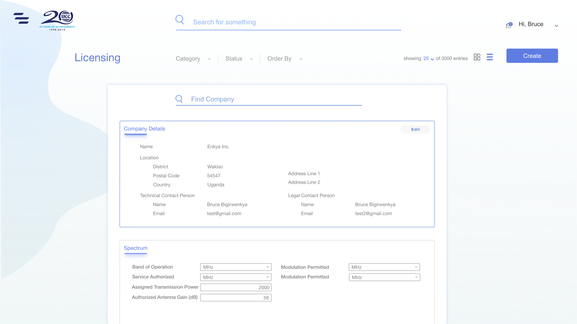
For this article, we will be implementing the layout for the form in this Behance mockup.
 |
|---|
| Form manipulation mockups by Bruce Bigirwenkya — Behance.net |
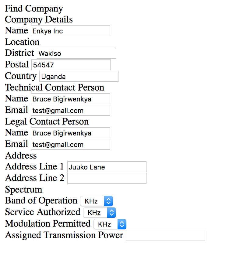
We start off by generating the markup.
This is pretty much just visualising it and writing markup for it in a way that makes sense at first sight. We can always review it later.
 |
|---|
| Review markup code at this gist |
We then set the display property of the container as display: grid . This will set the grid formatting context for the contents of the container and keep the container with the default occupation of 100% width within its parent.
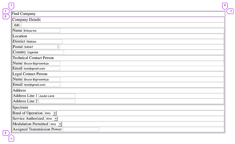
So as soon as we set the container’s display to grid, the grid placement algorithm kicks in.
The items will be placed automatically in the order in which they are declared in the markup into grid-tracks from auto-generated grid-lines. Think of tracks as trails in the ground which can either be rows or columns.
We can observe that 2 rows are created. The grid lines are labelled with their index value starting from 1 to the last, n, being -1. We shall later look at how to use the grid-line numbers for placement.
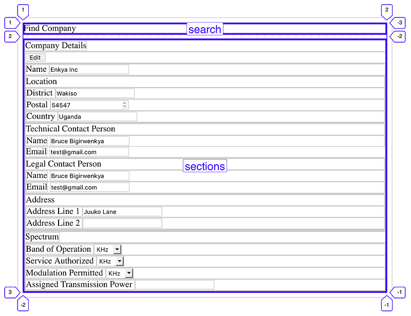
We can also identify from our mockup that the form has 3 sections. The first section is a search section and the remaining two sections have form details.
We made an exception in our markup for the search element. The remaining two go under the sections element.
<div class="container">
  <div class="search">Find Company</div>
  <div class="sections">
    <div class="company section"></div>
    <div class="spectrum section"></div>
  </div>
</div>
Let’s update our stylesheet
.container {
  display: grid;
  grid-template-areas: "search"
                       "sections";
  grid-template-columns: 1fr;
  grid-template-rows: auto 1fr;
  margin: 0.5rem;
  row-gap: 0.5rem;
}
Let’s go over a couple of these rules.
grid-template-areas
This property allows us to specify named grid areas. These areas allow for definition of a meaningful structure.
We set grid-template-areas: "search" "sections" to define two areas. Each string section (in quotes) is defined as a row. The contents of each string are processed into tokens which define the columns of that area.
The tokens can be:
- A null cell token represents an unnamed area in the grid container.
- A named cell token creates a named grid area with the same name. Multiple named cell tokens within and between rows create a single named grid area that spans the corresponding grid cells.
- A trash token is a syntax error, and makes the declaration invalid.
grid-template-columns / grid-template-rows
These properties enable us to explicitly size the grid-tracks. They are used for columns and rows respectively. This takes values of either none or a track-list which is basically a sequence of line names and track sizing functions.
Some of the track sizing functions currently are:
max-contentThis represents the maximum size of the contents of the grid cellmin-contentThis inversely represents the minimum size of the grid cell as specified by the provided valueminmax(min, max)This defines how the content will fit in the range of the provided min and max valuesfit-contentrepresents a formulaminmax(auto, max-content)which basically evaluates to the contents filling the available space provided.flexthis specifies the item’s flex factor. Items with a flex factor expand to occupy the remaining space in the ratio of the specified flex factor. Its unit is frautorepresents the maximum content available
In this case, we use grid-template-columns: 1fr to define one column which flexes to fill the available space in the container. We use grid-template-rows: auto 1fr to define two rows where one is only as large as its contents. The other expands to fill up the remaining space.
Noticeably, the column and row template definitions are aligned with the area definitions.
column-gap / row-gap
These properties define specified fixed-length gutters between items in a container. They are actually not defined in the grid specification but rather in the CSS Box Alignment specification. They take normal values or percentage values.
Note:
Initially, we hadgrid-column-gapandgrid-row-gap. The grid shorthand had an issue where it was resetting the grid-gap properties. The grid-gap properties were then disconnected from the grid shorthand and defined in the Box Alignment Spec.
In our example, we set the row-gap to 0.5rem and also create margins of the same size. The outcome is shown below
 |
|---|
| areas generated by grid-template-areas property |
Tip 1:
Anytime you see the word template in a property, you know that the property defines a structure of the grid i.e. defines the surface on which items can be placed
Next, we lay out the search section.
.search {
  grid-area: search;
  justify-self: center;
}
grid-area
This property is used to define the placement for an item in a specified grid area either via the area name or via the grid track line.
grid-area: <name> | <grid-row-start> / <grid-column-start> / <grid-row-end> / <grid-column-end>
start and stop in the property values define the track lines where items start and stop.
Apart from the name, the rest of the option values can either be
<line> (which is a number as shown by the purple markers in the images)
span <number | name> (an instruction for the item to span a number of tracks or until the next line with the provided name.
auto indicating auto-placement, an automatic span or a default span of one
In this case the search section spans the search area. Note how the definition of the search area is not in quotes.
justify-self / align-self
These properties of the CSS Align module align the box/item along the different axes of the container.
justify-self is used for the main-axis alignment. align-self is used for the cross-axis alignment.
Their values are auto, normal, stretch, left, right or self-position which factor in other positioning functions like flex-end and flex-start.
justify-items and align-items are used by the grid container to define the default justify-self/place-self values for all its items.
 |
|---|
| justify-self: center |
Tip 2:
Anytime you see the word self in a property, you know that it defines a rule for the placement of a particular item within its container
Next, we place the sections element in the sections area and create another grid within. This grid will have more columns to create a more divisible space.
.sections {
  grid-area: sections;
  display: grid;
  gap: 1rem;
  grid-template-columns: repeat(12, 1fr);
  grid-template-rows: auto auto;
}
The resulting grid has 12 columns and 2 rows.
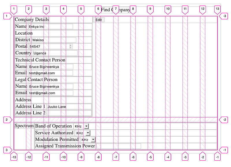
Repeat
The repeat notation allows us to generate multiple tracks with a recurring pattern. This function takes two arguments. The first argument can be; a positive integer, auto-fill, auto-fit . The second argument is a track-list.
auto-fill works with an explicitly sized grid to generate as many tracks as possible without overflowing the grid container.
auto-fit behaves the same as auto-fill except that after grid item placement any empty repeated tracks are collapsed.
. . .
Next, we create a grid for each section. We create sections for the title, action points like buttons and the details to go in the form.
.sections .section {
  grid-column: span 12;
  display: grid;
  grid-template-columns: auto 1fr;
  grid-template-rows: auto auto;
  grid-template-areas: "title actions" "details details";
}
.sections .section .title {
  grid-area: title;
}
.sections .section .actions {
  grid-area: actions;
  place-self: end;
}
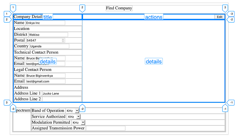 |
|---|
| Action items are justified and aligned to the end |
One new rule is introduced here.
place-self / place-items
This is a short-hand for alignment i.e. place-self: <align-self> <justify-self>
. . .
So let’s add the rest of the code to position the elements within the details sections in a grid format.
.sections .section .details {
  grid-area: details;
  display: grid;
  grid-template-columns: 50%;
  grid-template-rows: repeat(3, auto);
  justify-items: start;
  row-gap: 0.5rem;
}
.sections .section .details > div {
  padding: 0 2rem;
}
.sections .section .details > div > div {
  padding: 0 2rem;
}
.sections .section .details > div .section-header {
  padding: 0;
}

.company .name {
  grid-area: 1 / span 1;
}
.company .location {
  grid-area: 2 / 1 / span 1 / 2;
}
.company .technical_contact {
  grid-row: 3;
}
.company .address {
  grid-area: 3/2/span 1/-1;
}
.company .legal_contact {
  grid-row: 2;
}

.Spectrum .band {
  grid-column: 1;
  grid-row: 1;
}
.Spectrum .service {
  grid-row: 2;
}
.Spectrum .modulation {
  grid-row: 3;
}
.Spectrum .transPower {
  grid-row: 4;
}
We use the support of the child combinator (>), we are able to select divs within the details and give them a padding (in purple) to create a consistent indent for sub-elements.
 |
|---|
| positioning for the input elements |
Things to note:
- Even though we specify one explicit column for the grid, when placing explicitly positioned items. If an out of bounds column number is specified, extra tracks are generated implicitly for the grid.
- Something I wanted to do was automatically position half the available inputs in a form section on the left and then position the remaining half of them on the right. I found that challenging because of the inability of CSS to count elements. Solutions can be improvised using the nth-child selector but it might be a challenge.
- Understanding CSS Grid’s item placement algorithm can help guide you in achieving other auto positioning rules
Tip 3:
You can use Firefox’s developer tools to visualise your grid. See link for more details on how to do it
What is the Grid Item Placement Algorithm?
This algorithm determines and resolves the positions of grid items into definite positions.
By default, the auto-placement algorithm takes row as its initial value. This can be overridden by setting grid-auto-flow to column or dense .
How the algorithm works
- Generate anonymous grid items. These are sort of “pseudo” elements which the algorithm creates for items that aren’t explicitly generated by the component tree
- Position anything that is not auto-positioned
- Process the items locked to a given row
- Determine the columns in the implicit grid
- Position the remaining grid items
Refer to the official spec to understand more about how this algorithm works.
References
Do let me know in the comments if you have any questions
Cheers ❤️ 🚀